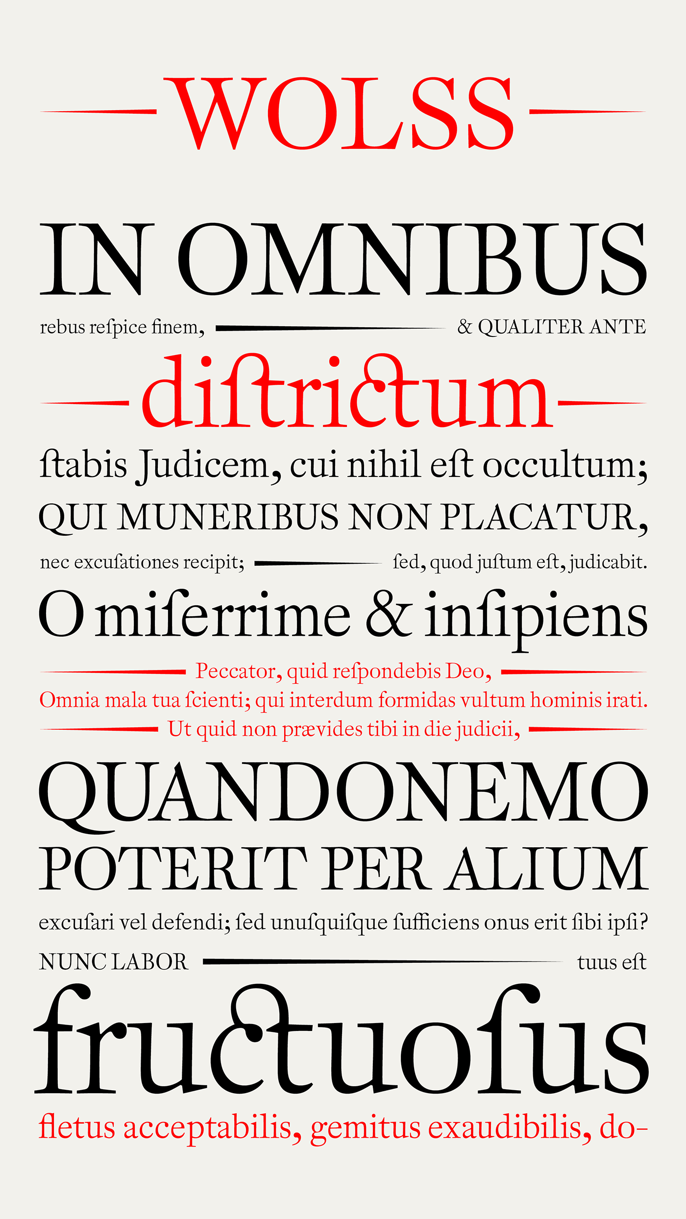
About Wolss: An 18th-century revival
Wolss is a revival based on Groote Augustyn Romyn cut in 1760 by the Flemish punchcutter Jan Baptist van Wolsschaten (1714–1776). The face is relatively light compared to its eighteenth-century contemporaries, features narrow proportions and sharp details in its design. The digital interpretation reflects the findings of thorough research into the original type and printed materials preserved in the collection of Museum Plantin-Moretus in Antwerp, Belgium.
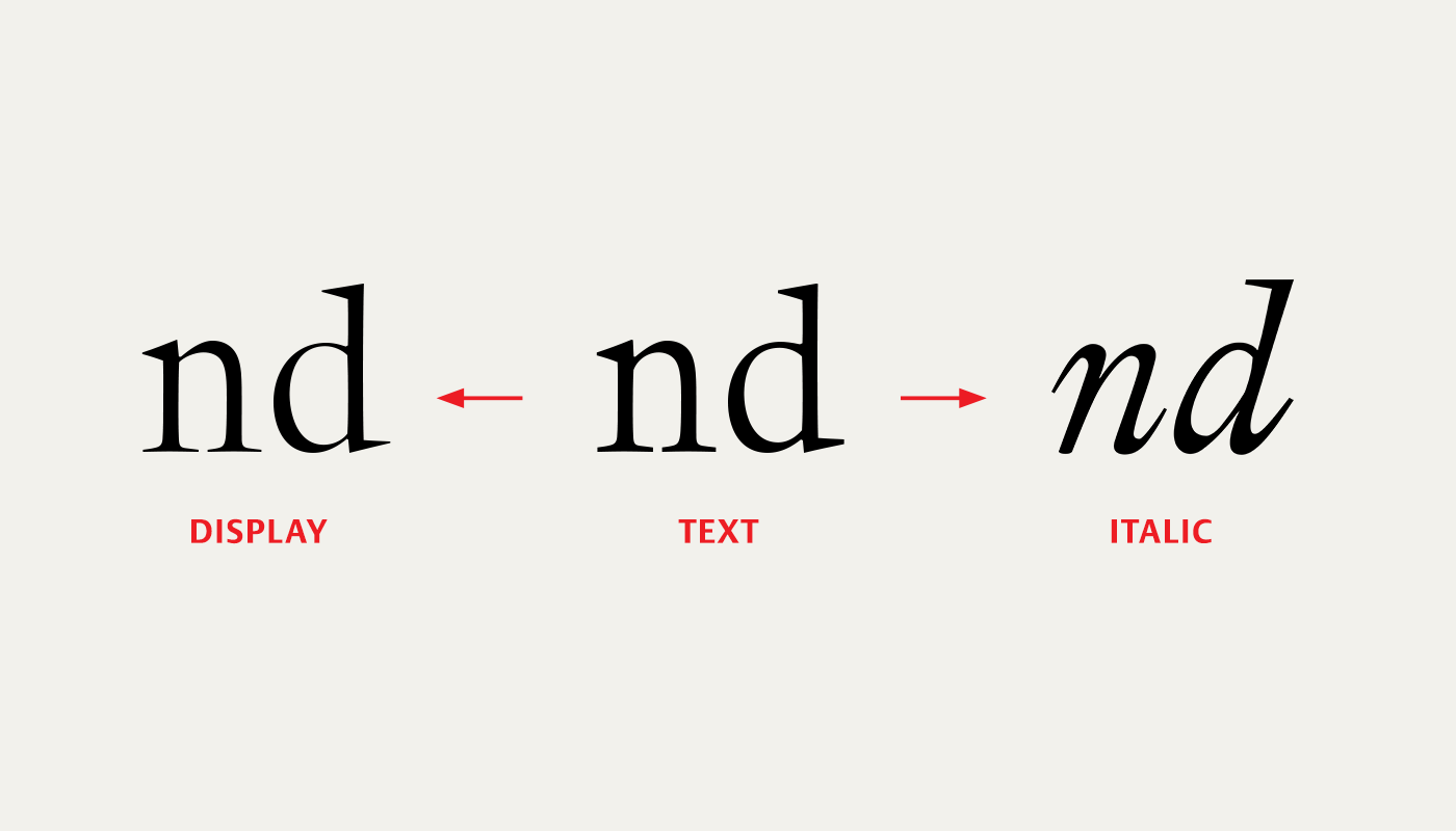
The underlying grid system used in this Baroque type is reminiscent of Renaissance foundry type production methods, and is also applied to the final revival. Wolss currently includes a text style suitable for use in small sizes and also a display version emphasizing the characteristic design details found in the original punches.
Research
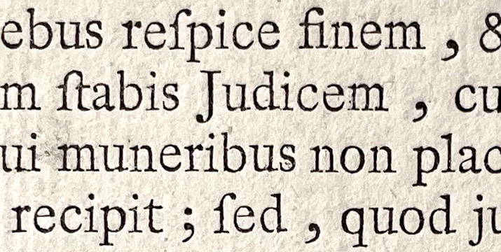
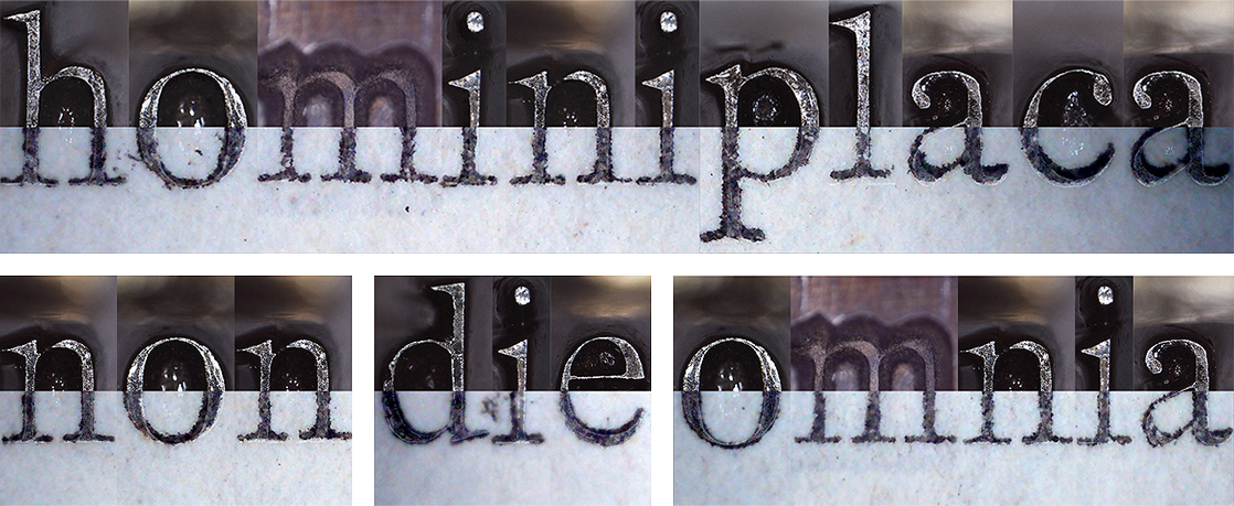
Wolss is a revival of Groote Augustyn Romyn cut in 1760 by the Flemish punchcutter Jan Baptist van Wolsschaten (1714–1776) who was a member of the Van Wolsschaten family of printers and type-founders in Antwerp. The original matrices and punches are preserved in the collection of Museum Plantin-Moretus along with historical type specimens and books showing printed samples of the type. The target size of Groote Augustyn Romyn is about 12 pica points, making the original type suitable for text use. The face is relatively light compared to its eighteenth-century contemporaries, features narrow proportions and sharp details in its design.
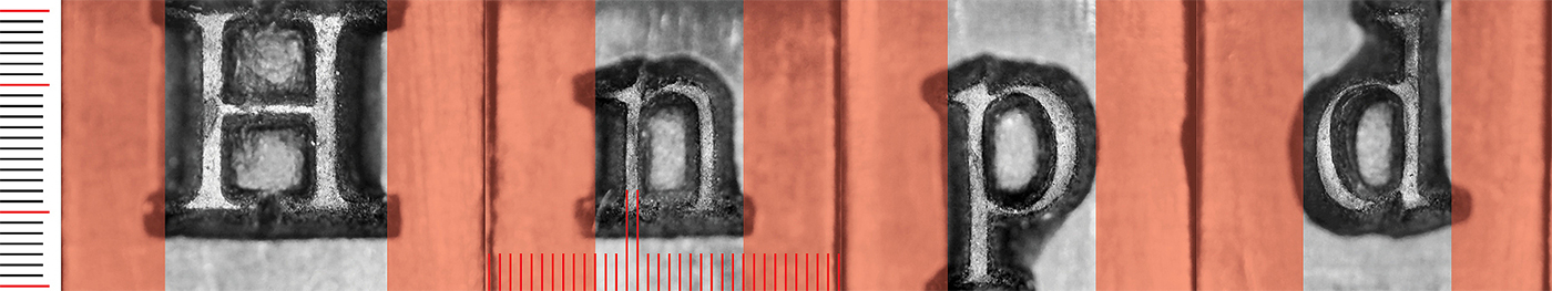
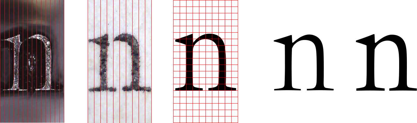
The examination of the matrices supports Dr. Frank E. Blokland’s1 dissertation about the standardised production methods in historical foundry type: Matrix widths were standardised and justified for fixed registers, and a stem-based unitisation system could be distilled. This system could be used for setting the ratios for x-height and ascenders/descenders, and fitting (spacing).
Development of the text style
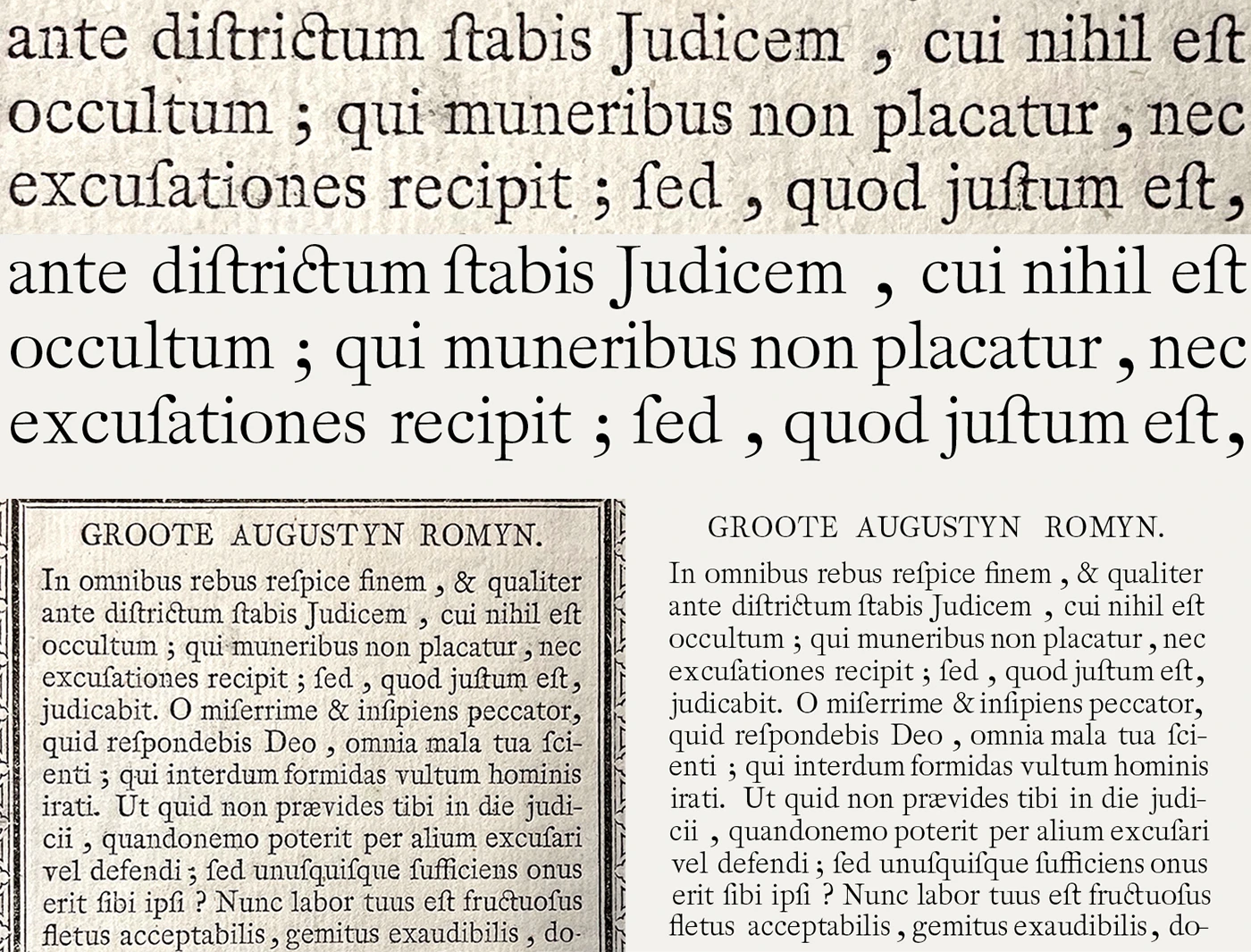
The unitisations derived from the matrices were initially used as a basis for the digital drawings; however, the result proved to be too light to read comfortably when set in text sizes. Although the punches and matrices were delicate in places, the ink spread as a result of the printing process caused emboldening of the type. In order to reflect this effect, historical prints were used to recalculate the unitisation system.
A square grid was then formed based on these units and used as a framework during the design process. Since the matrix widths were standardised, it was possible to set the character widths with the help of the unitisation system and therefore reproduce digitally the original fitting of the type.
Development of the display style
Whilst the type was made darker to be used for text purposes at small sizes, the original extremities of the type were moderated as a result of the lowered contrast. Details such as the hairline joints and sharp serifs were toned down in order to improve reading.
As a consequence, a higher contrast display version of the type was also worked on which would incorporate these formal details. For the display, the punches were taken as a basis whereas for the text, printed materials were referred to considering the ink spread. Additionally, further exaggerations in the details were added for emphasis in the display style.
Italic exploration
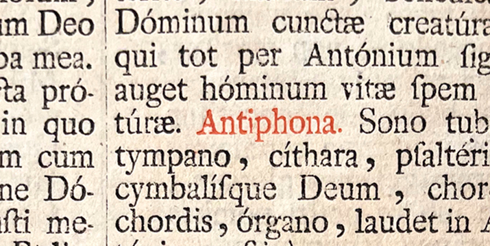
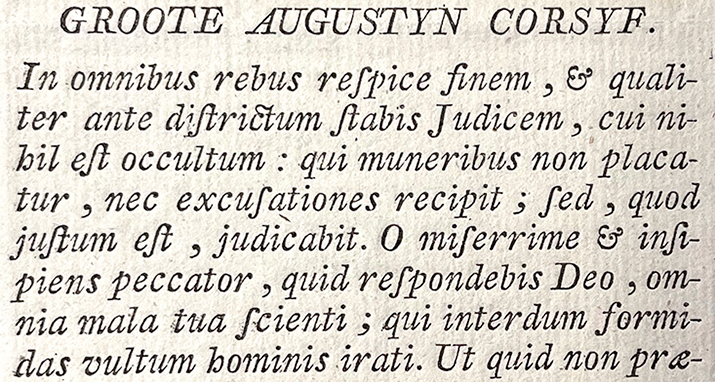
The 1775 specimen signed by Van Wolsschaten also features a matching italic for Groote Augustyn Romyn, titled Groote Augustyn Corsyf. According to John Lane2, this italic was cut soon after the roman, based on a survey of the surviving specimens.
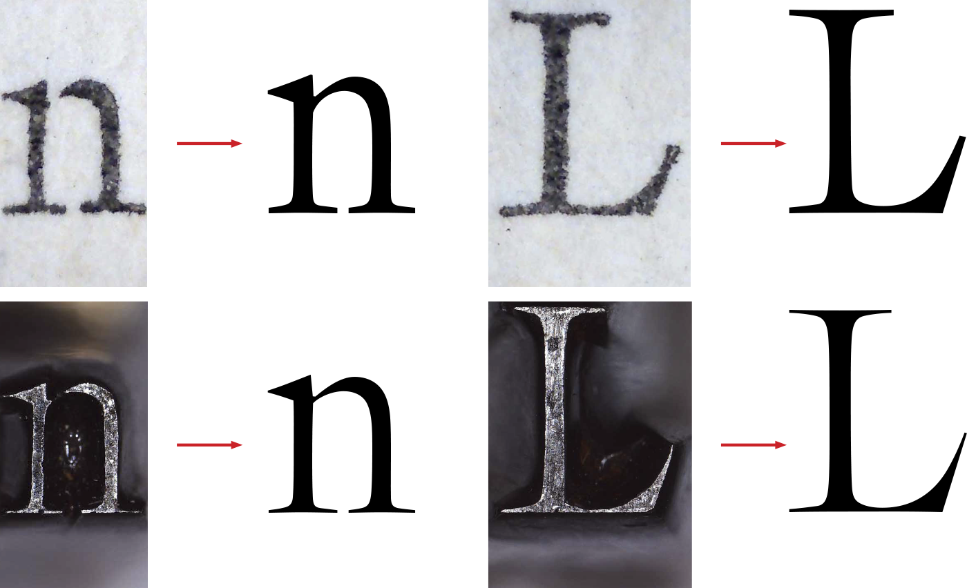
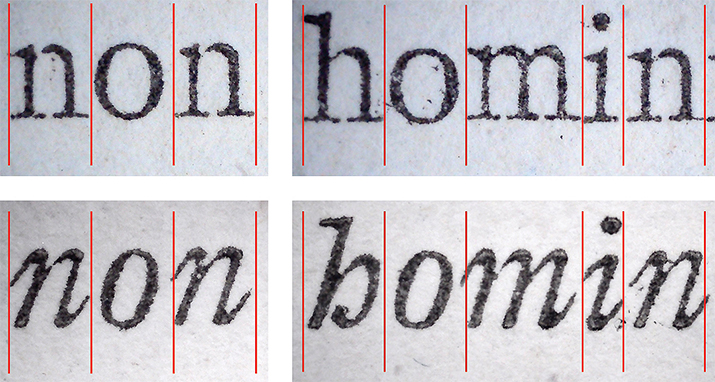
As part of the project, the fitting of the italic style was examined and some early design explorations were also created. Since the punches and matrices were not available for the italic, the research is based on the printed source material only. The goal was to understand if there is any matching unitisation between the roman and italic styles of Groote Augustyn. Although it was interesting to observe that some letters, such as the /n, had matching proportions, more research would be needed to conclude if there is an underlying standardisation of production between these two types.
Wolss family
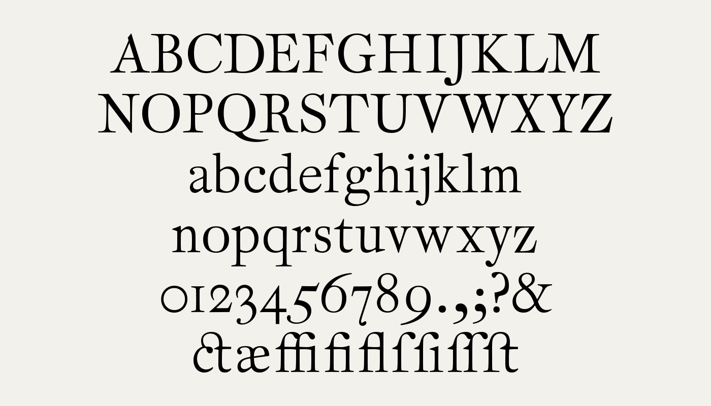
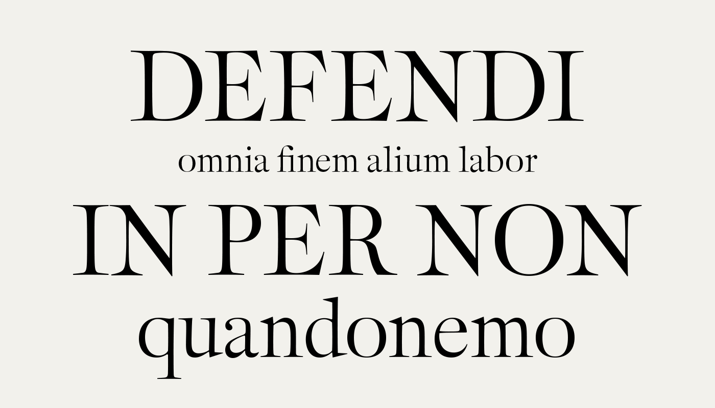
The project originally envisioned an extended Latin character set for contemporary use, forming a family of three styles: text, display and italic.
The text and display styles were developed along a variable optical size axis, allowing control of contrast flow through modulation of serif height and the thickness of the thin strokes. The italic was conceived to complement the text style, following the spirit of the original cut by the Van Wolsschaten.
Wolss typeface was designed and developed during the Expert class Type design 2021–22 at the Plantin Institute of Typography. I would like to thank Dr. Frank E. Blokland for his guidance and supervision, and Jan Van der Linden, Bart Van Put and Museum Plantin-Moretus for their help and support throughout the project.
1 Frank E. Blokland, On the Origin of Patterning in Movable Latin Type: Renaissance Standardisation, Systematisation, and Unitisation of Textura and Roman Type (Leiden: Leiden University, 2016). lettermodel.org
2 John A. Lane, Early Type Specimens in the Plantin-Moretus Museum (New Castle: Oak Knoll Press, 2004), p.102.