Background notes about Manchet
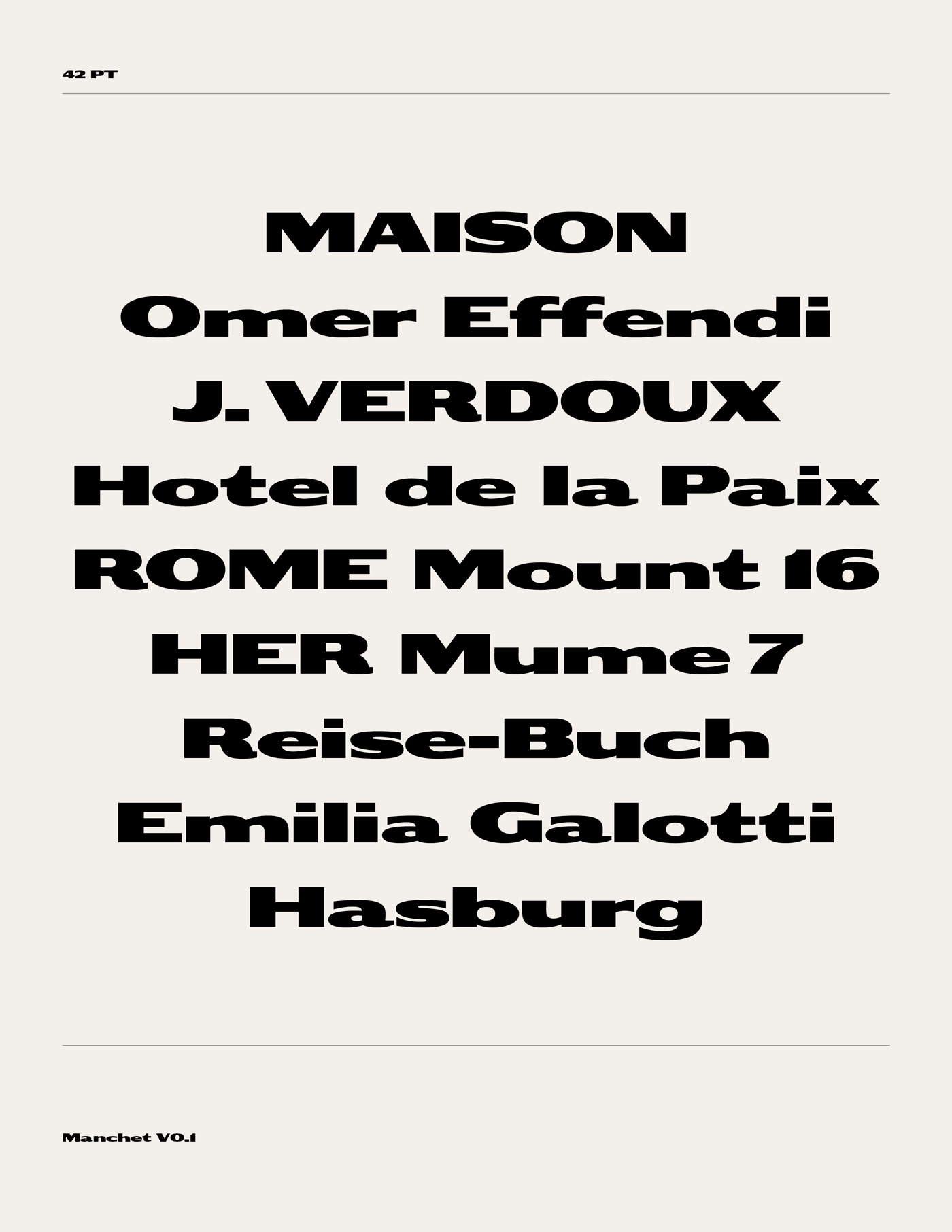
Manchet is an interpretation of nineteenth-century expanded sans-serif styles. The project began with a type found in the 1881 edition of an annual commercial directory published in Istanbul during the late Ottoman era. Historical examples of Gothic Expanded No. 2 and earlier Gothic Extended wood type informed its proportions and details. Manchet is not a direct digitisation of these examples, but an interpretation of their characteristic forms and details for use today.
L’indicateur Ottoman, 1881
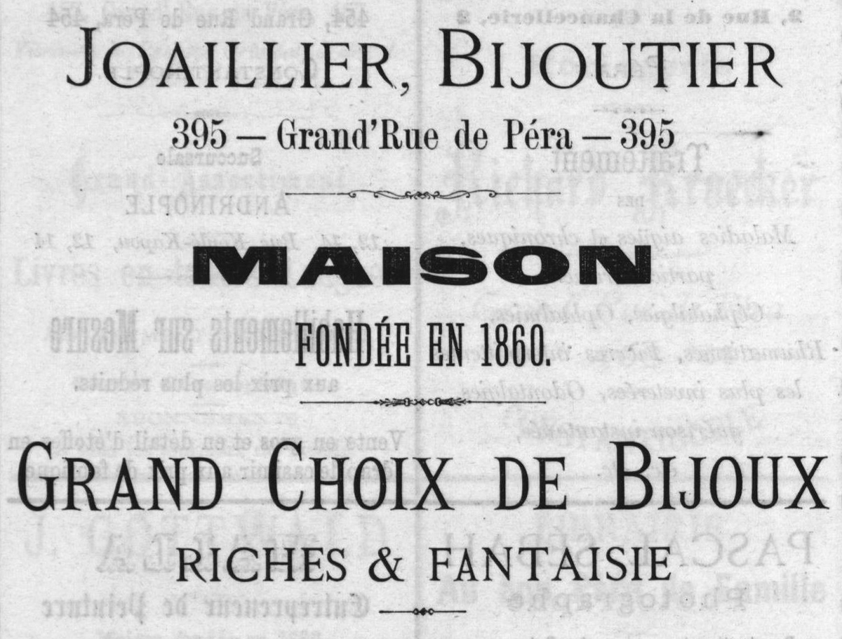
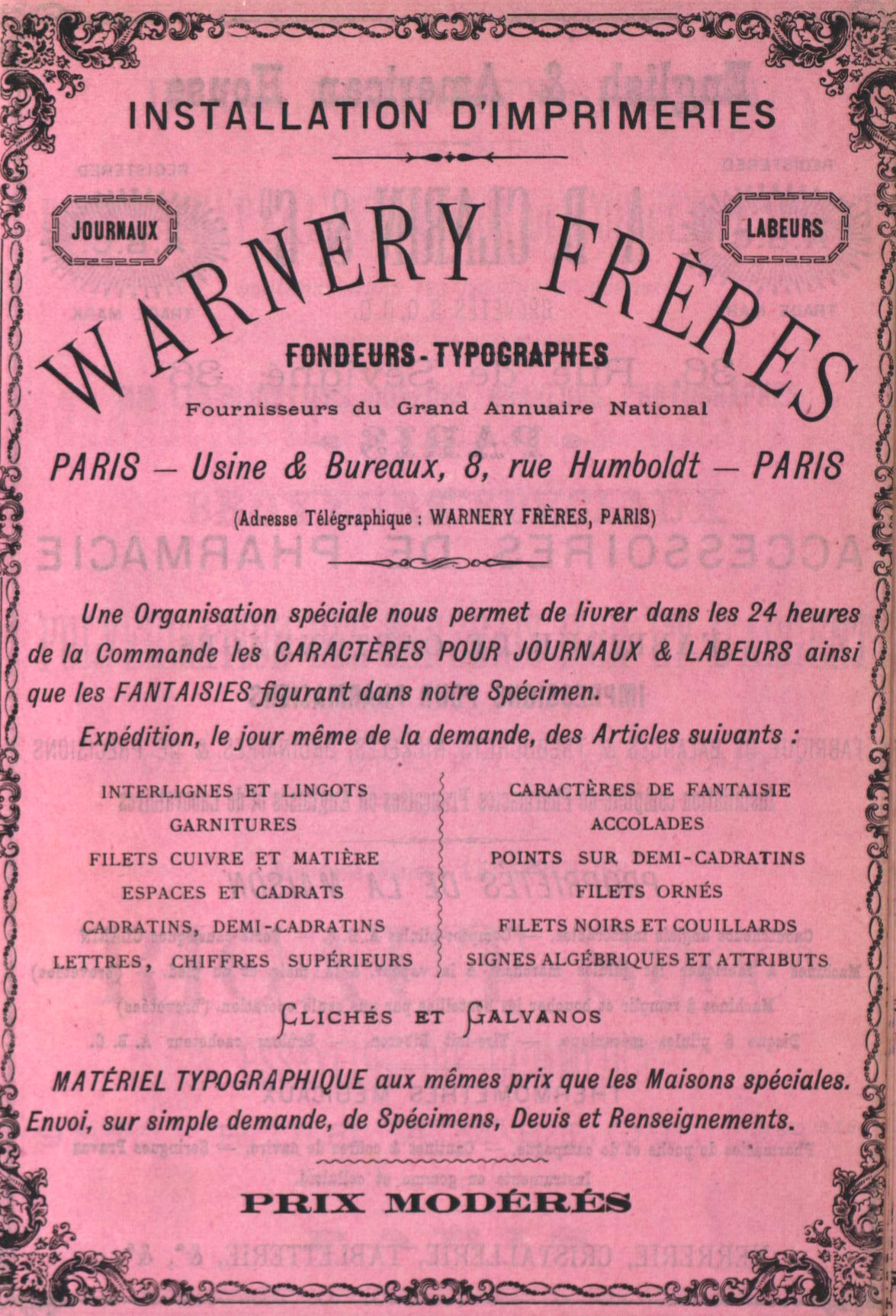
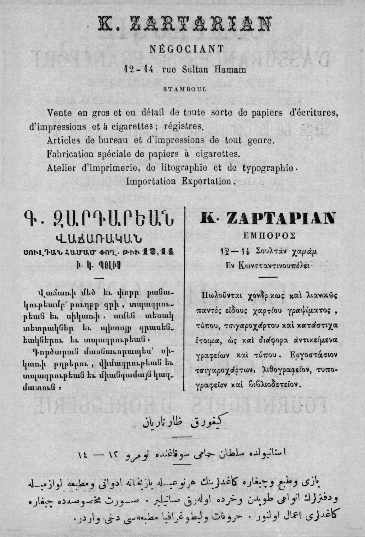
Manchet began with a type I found in the 1881 edition of L’Indicateur Ottoman (later known as Indicateur Oriental and Annuaire Oriental), an annual commercial directory published in Istanbul during the late Ottoman era. An expanded, heavy sans-serif was used for the main headlines of advertisements throughout the publication, with its monumental proportions softened by humanist details in the letterforms, such as the tails of the t and a, and the leg of the R.
Published by Cervati Frères & D. Fatzea, the 1881 directory was printed in multiple scripts, including Latin, Armenian, Greek and Arabic, reflecting the multilingual nature of commercial life in late Ottoman Istanbul. Since advertisements for European type foundries, such as Warnery Frères and Deberny & Cie, appear throughout the directory’s various issues, I started looking toward European sources when trying to identify the type.
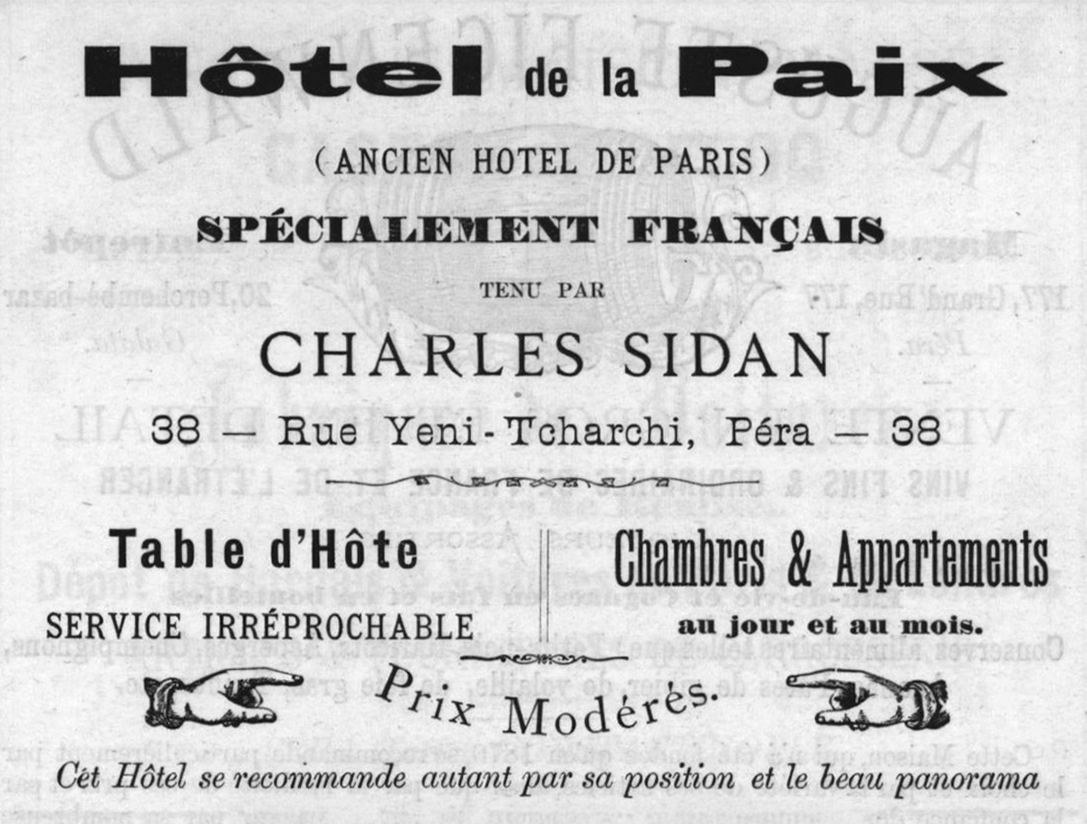
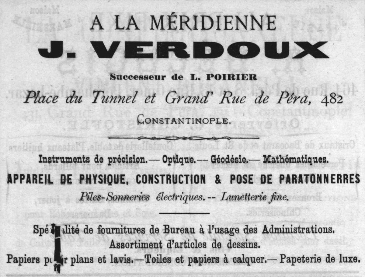
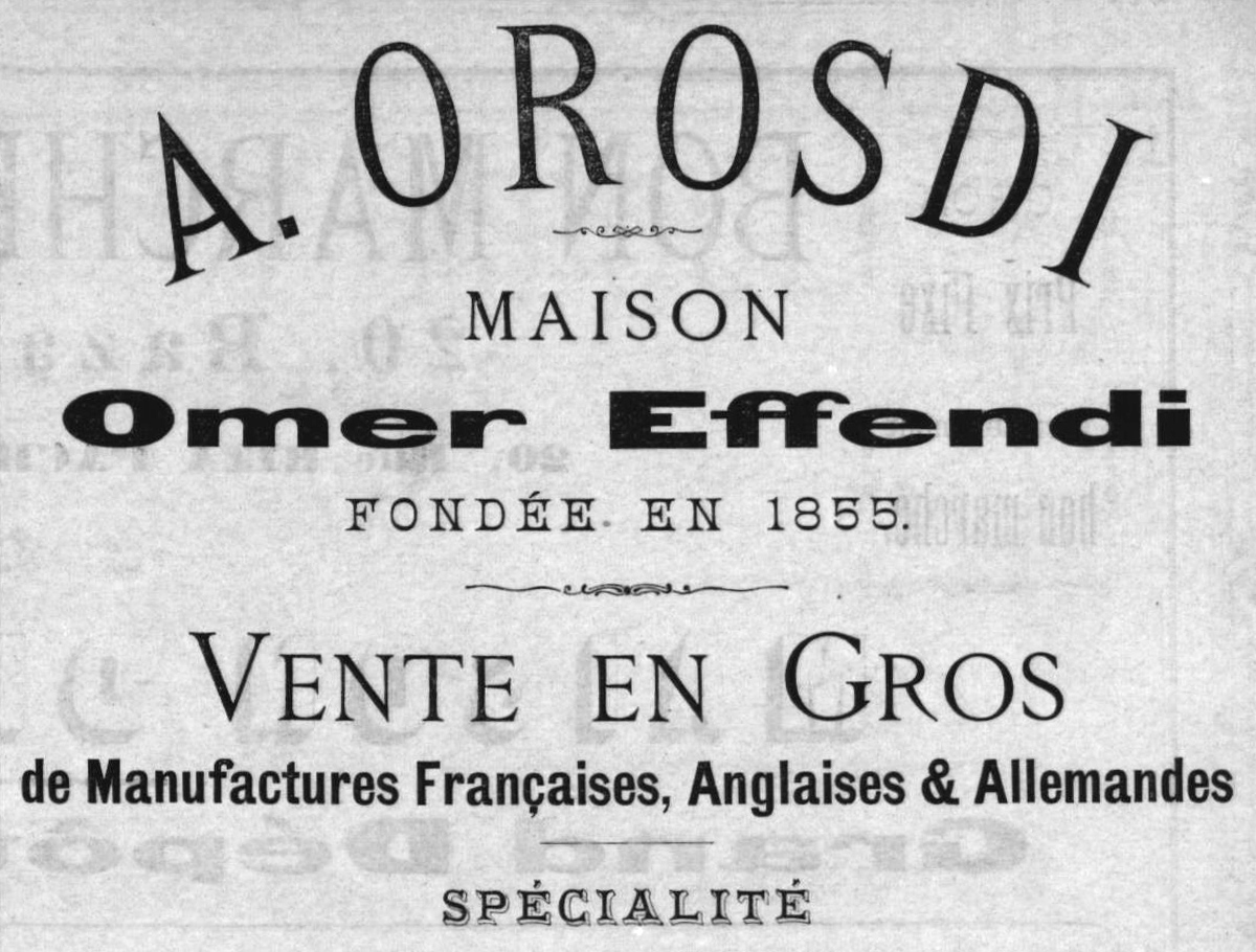
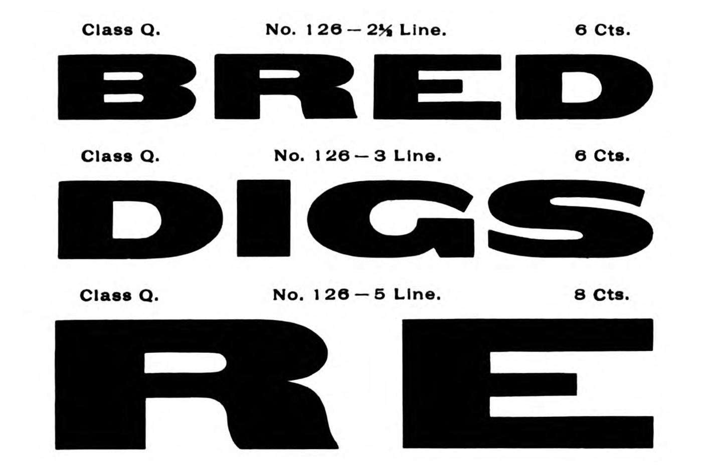
Gothic Expanded, No. 2
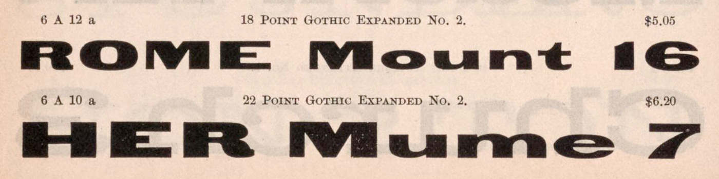
While looking through historical type specimens, I found a match for the type used in L’Indicateur Ottoman in Dan Reynolds’s online Database of sans serifs sold in 19th-century Germany. The design is listed as “Gothic Expanded, No. 2”, with James Conner’s Sons in the US identified as the publishing foundry. The earliest example I have been able to locate digitally is in an 1891 type specimen from James Conner’s Sons, where “Gothic Expanded, No. 2” appears in 18 and 22 point sizes. The oldest German-language showing in Reynolds’s database is an 1867 Schelter & Giesecke specimen, where the design appears under the name “Blockschrift 358”. It also appears under the same name in the foundry’s 1886 and 1900 type specimens. The Conner and Schelter examples are remarkably close in their letterforms, including several of the distinctive details that can also be seen in the type used in L’Indicateur Ottoman.
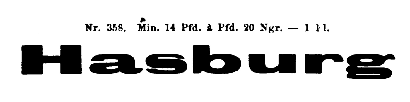
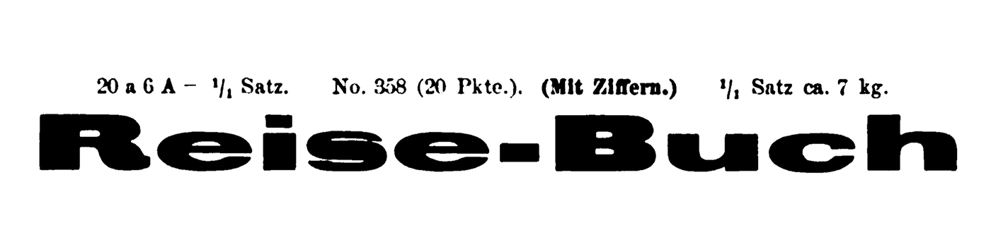
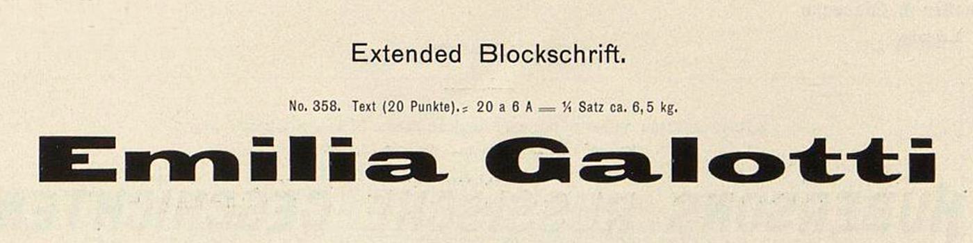
Gothic Extended
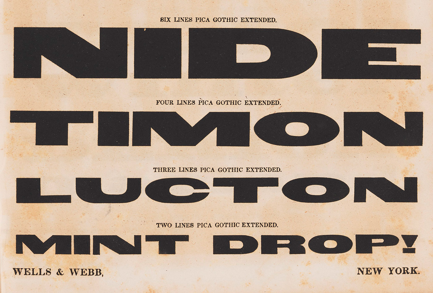
Looking further back, I came across a similar expanded sans-serif in American wood type. According to Rob Roy Kelly, Darius Wells and E. R. Webb first showed their “Gothic Extended” in Specimen of Plain and Ornamental Wood Type, Cut by Machinery in 1840, and the design most likely originated as wood type. A later Hamilton specimen shows another cut of Gothic Extended. Several of the letterforms in the Gothic Extended style share distinctive design features with the Gothic Expanded No. 2 examples, while the overall proportions are similarly expansive.
Manchet
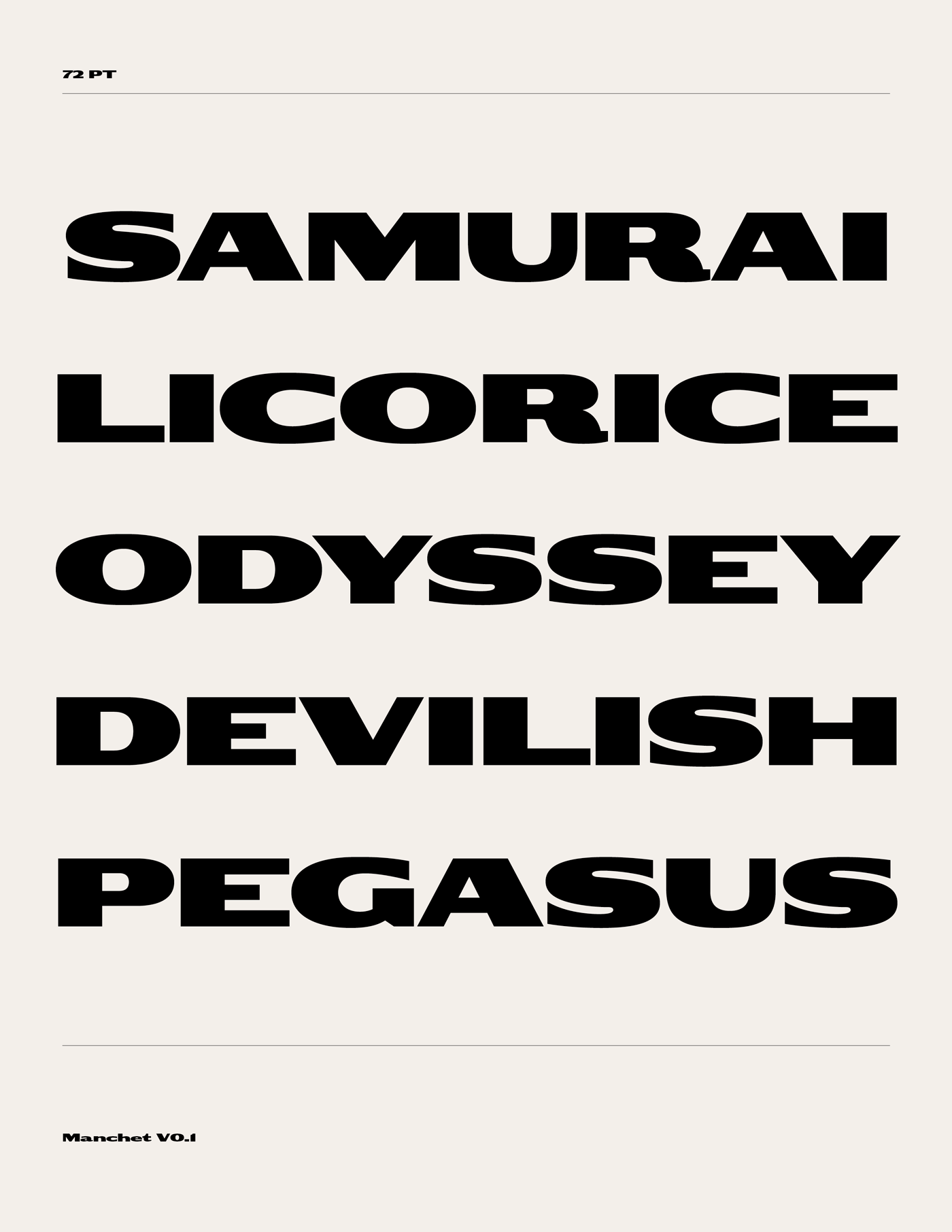
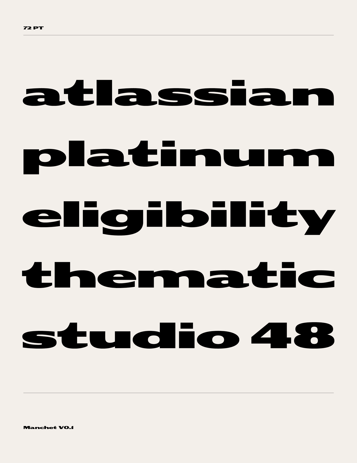
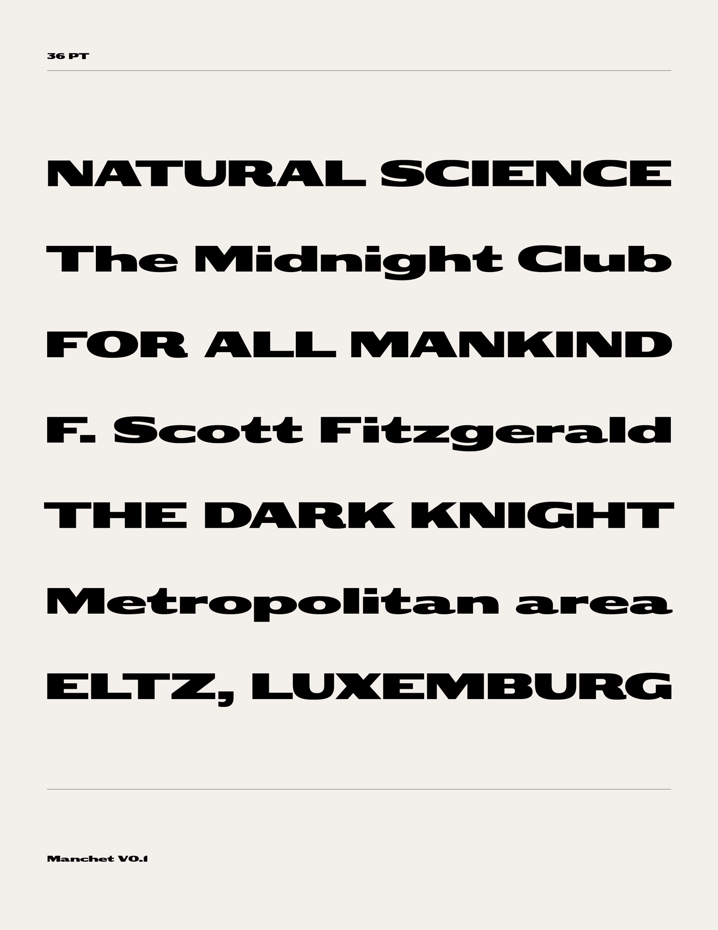
Manchet is not a direct digitisation of these historical examples, but an interpretation of their characteristic forms and details for use today. The proportions and weight have been slightly adjusted, while the stroke contrast of the lowercase has in particular been modified to help improve readability in longer settings. Elements from both Gothic Extended and Gothic Expanded No. 2 have informed the design, with details such as the diagonal terminals seen in some Gothic Extended examples influencing the terminal treatment in Manchet rather than the horizontally cut terminals of Gothic Expanded No. 2. The specimens I worked from did not provide a complete set of characters, so some have been derived while others have been deliberately reinterpreted; for example, Manchet uses a single-storey g rather than the double-storey form seen in the references.
Version 0.1 includes uppercase and lowercase A–Z, numerals and basic punctuation. Future releases will expand the character set and language coverage. A trial font is available upon request.
References
L'Indicateur Ottoman. Annuaire almanach du commerce de l'industrie, de l'administration et de la magistrature (1881). Cervati Frères & D. Fatzea. SALT Research.
Dan Reynolds, Database of sans serifs sold in 19th-century Germany. TypeOff.
Rob Roy Kelly, American Wood Type, 1828–1900 (New York: Van Nostrand Reinhold, 1969). Internet Archive.
Rob Roy Kelly American Wood Type Collection, Gothic Extended. University of Texas at Austin. RRK American Wood Type Collection.